Kwantlen fashion students finalists in Télio design competition
December 11, 2010 by Josh Saggau · 1 Comment

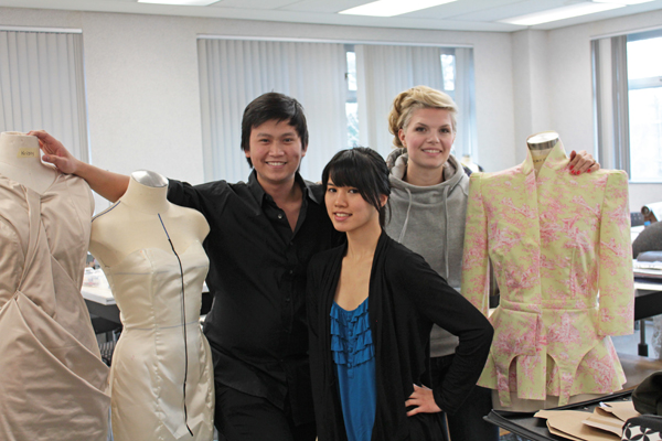
Earl Mabaquiao (left), Kristin Yip and Laura Nickel pose with some of the work they have done for school. None of the three have begun the creation of their garment yet. (Photo by Josh Saggau)
For most students the semester is winding down, but for three of the fashion department’s top students, the work is just beginning.
Earl Mabaquiao, Kristin Yip and Laura Nickel have been named three of 25 finalists in the 2001 Télio Design Competition.
They now have just five days, once their schoolwork is done, to complete a garment they designed for the competition, which will be held in February. The competition, put on be Montreal-based textile company Télio, invites fashion students from across Canada to design and, now that they have been named finalists, create a garment, which will be presented to judges during Montreal Fashion Week.
“Part of the thing that’s also stressful about the competition is that we’re students, and part of the competition rules is that we can’t ask for help from anyone else, so we have to figure everything out on our own. We’ve all done these crazy designs, not thinking that were actually going to get in and now we have to make it on our own,” said Nickel.
But the trio is excited to showcase what they can do.
“It’s a pretty big deal for us, especially as students. It’s a great opportunity. I think one of the best opportunities as a student in Canada, to show at this event, because it’s a national competition and we have so many opportunities in winning the competition. Also, just in being place in those sort of circumstances, getting to talk with media, getting to talk with industry professionals, doing that networking, making those connections, and then also it’s a super-fun opportunity for most of us who don’t have the opportunity to travel, to have someone put us up in Montreal. Fly us out there and put us up and wine us and dine us. It’s really fun,” said Nickel.
Following the Montreal Fashion Week, Télio will announce five winners of scholarships totaling $10,000. The will be awarded based on the student’s ability to show creativity, use technical skills and capture the theme of the competition: Great Canadian North.
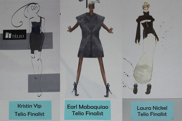
“I was inspired by the Aurora Borealis and its beauty. I wanted to take that beauty and take a still picture of it in the form of a garment,” said Yip.
Mabaquiao drew his inspiration for the weather of the north, while Nickel’s inspiration for her design came from the imperfections found in the north.
“There’s all these cracks and crevices and there’s such a rawness about it… These are the things we find so beautiful about the north,” said Nickel.
With the semester wrapping up and the university closing for winter break, the three finalist don’t have much time to complete their intricate designs before the competition. Because the fashion week and competition have been pushed up a month, the trio won’t have much time in the new year to complete their work.
“We don’t want to leave it ’til January,” said Yip.
Although the stress is clearly beginning to mount for them, with schoolwork to take care of before the start their garment, they have not lost their enthusiasm.
“At the end of the day, we are showing at Montreal Fashion Week, and to do that as students and someone else is giving us that opportunity, it’s great. It’s exciting but we just have to deliver because our names are attached to it,” said Mabaquiao.

Design sketches by the three finalist for the TÉLIO Design Competition. (Photo composite by Josh Saggau)
Guided by the invisible hand of design: Signage tells commuters more than just destination
January 10, 2010 by Justin Langille · Leave a Comment

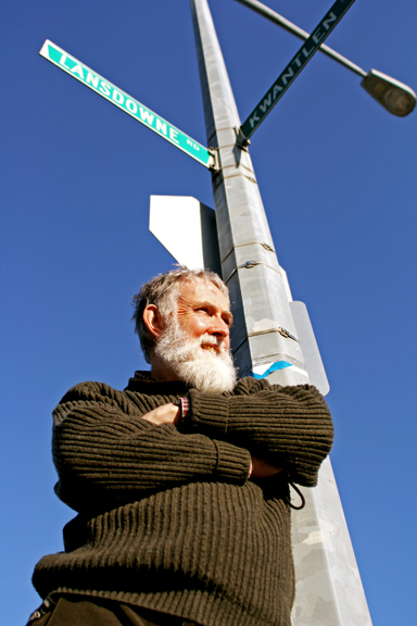
Ken Hughes of Kwantlen's graphic-design program says that standardized road-signs like those above, may become obsolete in the future. (Justin Langille/Kwantlen Chronicle)
Ken Hughes can’t stand it when British street signs aren’t there to do their job.
“Sometimes you’ll come around this traffic circle, looking for the sign that’s always there and there isn’t one. And you go, ‘You bastards! Why did you do that to me?’â€
An English expatriate who teaches graphic design at Kwantlen’s Richmond campus, Hughes has an intimate understanding of how important road signs are to modern transportation.
Over the past 10 years, Hughes has been studying signage by photographing lettering inscribed in stone, painted on walls and printed on signs in various places during his travels in Europe.
He knows that street signs, or “wayfinding graphics†in the graphic-design world, have meaning beyond just telling you where to go.
“[Road] signage makes…you feel like you’re being looked after,†said Hughes. “It’s almost like there’s an invisible human being saying, ‘If you want to go to Scotland from London, just follow the signs; you’ll get there. Just follow the signs. Have faith.’â€
Street signs, or “directional signs†to City of Vancouver engineers, aren’t celebrated like parks or bike lanes, but are considered a valuable and constantly evolving community service by those who work with them.
Street-name blades, the smaller signs attached to posts on street corners that tell you you’re at Hastings and Victoria, have changed in type size and reflectivity in recent years, enabling safer travel through the city, said Winston Chau, a transportation engineer for Vancouver.
The Transportation Association of Canada (TAC) dictates the overall design of signs in Vancouver, ensuring they conform to a standard: white, sans-serif lettering on black background, bordered by high-grade reflective tape.
Despite TAC’s guidelines, some Vancouver communities have reclaimed their signs and used them to express unique cultural identities.
Business-improvement associations in some of Vancouver’s popular neighbourhood districts have applied to the city to have their blades designed to represent their neighbourhood’s distinct cultural identity, said Chau.
Signs with Chinese characters and a distinct 1940s style distinguish Vancouver’s Chinatown, and signs for the Marpole area near South-West Marine Drive are printed in the language and symbols of the Musquem first nation, who historically inhabited the area. The newly refurbished Cambie Village, the Punjabi market at Main Street and 49th Avenue and posh Kerrisdale have also customized their street-sign blades to express character or historical importance.
All Vancouver street-signs, including pesky regulatory signs telling you where not to park downtown, are printed in the city’s sign shop, located at the National Works Yard just behind Pacific Central Station. Responsible for producing everything from venue signs to traffic redirection signs during the Olympics, the shop is shouldering its fair share of work for the games.
In the little spare time employees have, the shop also prints individual signs for people as part of their Street Signs for Everyone program. People can order plastic or metal signs, ranging in price from $50 to $90, featuring the names of any Vancouver street.
Nick Kazawa, an engineering department employee responsible for managing the shop, said that tourists and locals used to order replica signs of favorite Vancouver destinations such as Robson Street.
These days, however, people are more interested in having their own names printed on the signs.
Hughes said that these sorts of personal affiliations with street signs, and the cultural pride expressed by Vancouver’s custom neighbourhood signs, are evidence that people want street signs to be more than plain infrastructure.
Some designers, such as England’s Why Not Associates, are attempting to embed street signs into walls and sidewalks instead of littering the landscape with more poles, shapes and junk to look at, said Hughes.
Along with wayfinding information, the group is integrating historical information about the people and cities where the signage is based.
“It’s not just telling you where things are, but it’s telling you about what’s there. To me that is developing a sense of civic pride and knowledge of your district,†said Hughes.
“Especially if you’re younger…sometimes we’re so caught up in working on newer technologies that the history of a place escapes us,†said Hughes.
â€Picking up information on where you live, just because you have to see it everyday walking down the street…to me, that’s a great idea.â€


